Gavilan College Styleguide
Logos
History
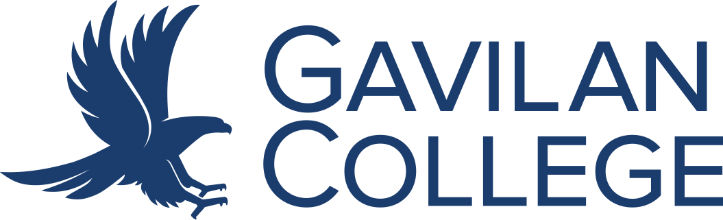
The Gavilan College logo represents a hawk (“Gavilan” in Spanish) superimposed over a stylized letter “G.”G Careful observers will note the similarity to the logo of the township of Pajaro (although in that case, the bird is superimposed over a letter “P”). The logo dates to the time of the Vietnam war, which was unpopular with student and faculty – hence the hawk was “softened” – no talons, rounded beak, to make it look peaceful.
Usage
The logo may not be altered, stretched, or tampered with. It may be printed in black ink on a white field, PMS 281 blue ink on a white filed, white on black, or white on blue. The logo should be used with the words “Gavilan College” in modified SKIA font. The logo may appear between the words Gavilan and College, to the left of the word Gavilan, or next to stacked Gavilan over College depending upon the overall layout of the document. Make sure you are using the appropriate version of the logo for each use: 300 dpi minimum at actual size for print,
Download
To download a logo, click on the description then right-click and choose 'Save image as...'
Blue Logo with white background
Side stacked with clear background
Lgo side stacked
White logo and clear background
Side stacked white logo and clear background
Athletics
Gavilan College Educational Foundation
College Seal